by: Nick Gressle
Hype Features Discussed in this article:
• Drag and Drop Actions
• Page Turn Animation
• HTML Widget Inline text fields
• Grouping
• Symbol creation and use.
• Multiple Timelines.
Why take an ancient form of Chess and adapt it for the iPad?
That is the question I received from so many friends and colleagues. The other was, will it make any money?
And that is how I began my journey making the game Hnefatafl for the iPad and sell it on the App Store.
The Concept:
I really like to play chess and I also love history so for me it was natural inclination that I would want to find out the origins of Chess and the evolution of it’s earlier variants.
During my search I came across the game Hnefatafl which was known as “Kings Table” or Norse Chess.
Hnefatafl is an ancient variant of Chess that more than likely began in Scandinavia before or around 400 AD and was known widely as “Tafl” translated into English, “Board” or Tablet.
The goals of Hnefatafl are to capture the King and win the game if you are the opposing army. And if you are the king to find safety in one of the corner Burgs and force the game to a draw.
The way one moves the pieces in Hnefatafl are like the moves for the Rook in Chess. Vertical along any open square and horizontal along any open square.
There are methods for capture and for blocking an opponents movements.
And while the combination of moves is not as myriad as that of chess it is still a very fun game with some great strategy.
Once I did my research and played a couple of online games with unseen players on the web I wanted to make a version of my own.
However, I wanted to hold the heritage of a tablet with 2 players battling across the board from one and other using their wits to defeat the other.
And while AI games are great and I am always working on those versions the thought of taking a 2 player old school game to a 21st century tafl was intriguing.
Planning the Build:
At the time I was using spare time to learn about Hnefatafl I was also beta testing Tumult Hype 3.0.
For me beta testing is only very valuable if I am building something actual that can take advantage of all of the features that need to be tested.
I want to put some meaning into the test and also a little bit of excitement and risk in using my creation with a slightly unstable build.
So I took the New Beta and approached the concept with a couple of rules for myself.
1. The board would be built with Hype Elements with texture fills that I created in Adobe Illustrator.
2. I would use the Hype Drag and Drop Actions that are built into Hype.
3. I would keep my importing of images to a minimum to make the game move as fast as possible.
4. And the deployment at the time would only be to my personal web page.
The Actual Build:
I have to say that the build itself was a lot of fun.
Hype is a very user intuitive interface that allows you to take your creative ideas and get them into a working vehicle very quickly.
And while I like to write code and scripts I prefer to focus heavily on the user interface design and the goals of the concept and information flow.
Hype allows me to do this.
The first step was to decide how big my Game surface would be. And while this original build was for the web only I did envision it to be played only on the iPad in keeping with my original concept of creating a 21st century Tafl.
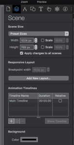
So I used the Hype preset scene size of a Horizontal iPad 1024px by 768px to set the scene.
This by the way is one of those features that you may think are pedestrian in an app like Hype, but for a Hybrid developer that wants to get up and running this is a golden nugget menu for speed and efficiency.
After doing that I went ahead and used the background color menu in the Scene portion of the inspector to also make a nice black background.
This is another good feature and you should use it whenever possible because Hype then writes the CSS to make the background which again makes for a more compact and cleaner file.
Creating The Board:
This took a little bit of math but was worth it in the end.
Again I did not want to import images in for each tile on the board but rather use the Hype Elements as much as I could and then fill one with a texture I created and saved as a .png file and then duplicate them to fill out the grid.
Hnefatafl comes in a few different grid combinations
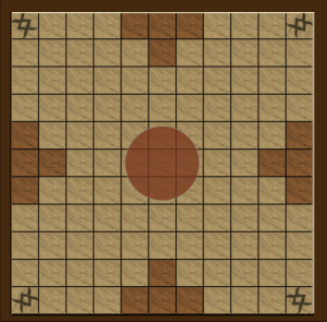
9×9, 11×11, 13×13, or the variety Alea Evangelii which is an
18 x18 board.
STEP 1: I MADE THE BOARD FRAME
This is just a very large brown rectangle that was 700px by 688 px and then I locked that on the layers tab once I placed it to the far left edge of my scene.
*NOTE*
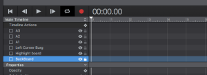
I feel it is very important to name each element in the layers palette with a specific name. Doing this while you are setting up will pay off later in efficient animation processes and editing of elements for other scenes.
For the iPad 2 and 3 I felt that a board of 11×11 would really fill the maximum footprint of the iPad and still leave me with areas for scoring and tail piece collection cups.
Each tile came out to be 56 x 56 pixels and I originally created one of those and then filled it with a .png texture that I created, and exported from Adobe Illustrator CC.
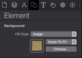
Then I began the process of duplicating the squares to make the first horizontal row.
Since these tiles would not move in the game I wanted to then group my completed row so I could then vertically duplicate it 11 more times.
When doing this you can drag the group and constrain the movement using your SHIFT key, but I also like to use the Metrics portion of the inspector a lot. To make sure my left edges line up where they should line up.
Another tip is to use the ALIGN and DISTRIBUTE submenus in the ARRANGE menu to quickly and accurately duplicate tiles in a board game. This method can save you several moments and eye strain.
Once I setup the full board I also added some other basic Hype elements to add to the aesthetics of the board.
A 56×56 colored square that was used as a translucent overlay for the opponents Barracks, and Hype Circle element for the Kings Throne area.
With that I had a completed board.
In my next Post I will talk about the Tafl pieces and how they were created and how to assign the drag and drop behaviors.
